




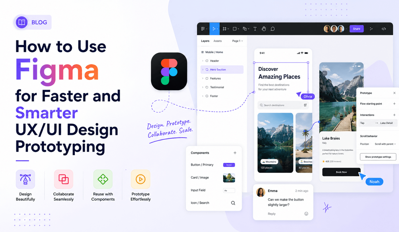
Introduction: The Tool That Changed How Designers Think
Imagine sitting down to design a mobile app — and instead of bouncing between five different tools, managing messy file exports, and waiting for developers to decode your static mockups — everything happens in one place. Your wireframes, your visual design, your interactive prototype, your developer handoff notes — all live, all collaborative, all in real time.
That is exactly what Figma delivers. And it has quietly become the single most important tool in modern UI UX design.
Whether you are a startup building your first product, an enterprise team managing complex design systems, or a business searching for a professional UI UX design company to partner with — understanding how Figma works will make you a better client, collaborator, and decision-maker.
What is Figma — And Why Does Everyone Use It?
Figma is a cloud-based design and prototyping tool built specifically for UI UX design. Unlike older tools such as Sketch (Mac-only) or Adobe XD (now discontinued), Figma runs entirely in the browser. There is nothing to install, nothing to update, and nothing to export before sharing.
This sounds simple. The implications are enormous.
When a designer makes a change in Figma, every stakeholder viewing that file sees the update instantly. When a developer opens a Figma link, they can inspect every dimension, spacing value, font, and colour without anyone sending a separate spec sheet. When two designers work on the same file simultaneously, they see each other's cursors in real time — like a Google Doc, but for design.
Key Stats That Tell the Story
- Over 4 million designers use Figma worldwide
- Figma is used by Apple, Google, Microsoft, Airbnb, and Twitter
- Teams report 50–70% faster design-to-development handoff vs traditional workflows
- In 2024, Figma introduced AI-powered features that are further accelerating prototype production
Why Prototyping is the Most Undervalued Step in Design
A prototype is an interactive simulation of your final product. It looks like the real thing, behaves like the real thing, and users can click through it like the real thing — but it requires no code, no development time, and no deployment.
Here is what prototyping catches before it becomes expensive:
- Navigation that confuses users — paths that make sense to the team but not real people
- Calls to action that don't convert — buttons missed, labels unclear, placements unnatural
- Mobile interaction problems — gestures, tap targets, scroll behaviours that break on devices
- Stakeholder misalignments — assumptions about features interpreted differently by different people
- Accessibility issues — contrast, font sizes, and tap target failures easy to fix in design, costly in code
The research is unambiguous: fixing a UX problem at the prototype stage costs approximately 10× less than fixing it after development, and 100× less than fixing it after launch. Prototyping is not a design luxury — it is a commercial necessity. And Figma does it better than any other tool on the market.
Getting Started with Figma: The Foundations You Need to Know
Setting Up Your Workspace
Figma organises work into three levels: Teams → Projects → Files. Setting this up correctly from the start saves enormous confusion later.
- Teams — hold all projects and files, manage permissions
- Projects — group related files (e.g. 'Mobile App Design' vs 'Marketing Website')
- Files — individual design documents per feature, platform, or product
Pro Tip
For mobile app UI UX design services, a clean file structure is essential. Mobile apps often have dozens of screens across multiple user flows, and without organised pages and frames, files become unmanageable fast.
Understanding Frames, Components, and Auto Layout
These three concepts are the engine of professional Figma work. Get them right and everything accelerates.
Frames are the containers for your designs — the 'artboards' where screens live. They can be nested inside each other, respond to constraints, and are used directly in prototyping. For mobile design, top-level frames should match device dimensions precisely (e.g. 390×844 for iPhone 14).
Components are reusable design elements. Design a button once, turn it into a component, and use it across hundreds of screens. When you update the master component, every instance updates automatically. This is how professional responsive UI UX design services are delivered at scale without inconsistency.
Auto Layout is Figma's most powerful feature for building responsive, realistic interfaces. Instead of manually positioning elements, Auto Layout allows frames to grow and shrink based on their content — exactly like CSS Flexbox in code. A button built with Auto Layout expands to fit longer text labels. A card resizes when content changes.
Building Your First Interactive Prototype in Figma
Here is a step-by-step walkthrough of creating a polished, interactive prototype — the kind a professional UI UX design company presents to clients or uses for usability testing.
Step 1 — Design Your Screens
Start with your key screens. For a mobile app, this typically includes:
- Onboarding / Welcome screen
- Sign Up / Login screen
- Home / Dashboard
- Core feature screen(s)
- Profile / Settings
- Success and Error states
Use real content — not placeholder text — wherever possible. Real content reveals real problems.
Step 2 — Switch to Prototype Mode
In Figma's right-hand panel you will see three tabs: Design, Prototype, and Inspect. Click Prototype to enter prototyping mode. In Prototype mode, every frame gets a small blue connection point on its right edge. Click and drag from this point to another frame to create an interaction.
Step 3 — Define Interactions and Transitions
When you connect two frames, a panel appears allowing you to define:
- Trigger: what the user does (On Click, On Hover, On Drag, After Delay)
- Action: what happens (Navigate To, Open Overlay, Scroll To, Back, Swap With)
- Animation: how the transition looks (Instant, Dissolve, Slide In/Out, Push, Smart Animate)
Smart Animate
When two connected frames share elements with the same name and layer structure, Smart Animate automatically interpolates between them — creating smooth, app-like animations without any code. This is the feature that makes Figma prototypes feel indistinguishable from real products in user testing.
Step 4 — Set Your Starting Frame
In the Prototype panel, set your Starting Frame — the screen where your prototype begins. This becomes the entry point when someone clicks the Play button to preview the prototype.
Step 5 — Preview and Test
Click the Play button (▶) in the top right corner. Figma opens your prototype in a new browser tab. You can test it yourself, or share the prototype link with stakeholders, clients, or user testing participants. The link is always live and always reflects the current state of the design.
Advanced Figma Features That Separate Good Prototypes from Great Ones
Variables and Conditional Prototyping
Figma's Variables feature allows you to create prototypes that respond to user input — not just clicks. You can set a variable when a user selects an option, and have screens display differently based on that selection. This enables realistic multi-state prototyping that mimics real app logic without writing a single line of code.
Interactive Components
Interactive Components allow you to build complex interaction states — hover states, toggle states, dropdown menus, checkbox behaviours — directly within a component. When that component is used in a prototype, its internal interactions work automatically without requiring separate prototype connections.
Figma Flows
A Flow in Figma is a named prototype path with its own starting frame. A single Figma file can contain multiple flows — 'New User Onboarding Flow', 'Purchase Flow', 'Settings Flow' — all shareable independently from the same file. For client presentations and usability testing, this is an enormous practical advantage.
Device Frames and Presentation Mode
Figma allows you to display your screens inside realistic device frames — iPhone, Android, iPad, desktop browser. This contextual presentation makes a significant difference in how stakeholders perceive and engage with the design. Seeing a mobile screen inside an iPhone frame creates an immediate mental connection to the real product experience.
Figma for Mobile App UI UX Design: Specific Strategies
Mobile app design has specific requirements that differ meaningfully from web design — and Figma has features built precisely for these needs.
Designing for Multiple Device Sizes
Modern mobile app UI UX design services must account for a wide range of screen sizes. Figma's Constraints and Auto Layout make this manageable. Design at a base size (typically 390px width for iOS), then use constraints to define how elements scale, pin, or reposition at different sizes.
Scrollable Frames
Most mobile screens are taller than the visible viewport. Figma handles this with scrollable frames — set a frame's content to overflow vertically, and in prototype mode, users can scroll through the content exactly as they would on a real device.
Gesture-Based Interactions
Mobile apps rely on gestures — swipe left to delete, pull down to refresh, pinch to zoom. Figma supports swipe interactions in prototyping, allowing you to simulate common gesture patterns such as swiping through a card carousel using drag interactions with slide transitions.
Safe Areas and Notch Handling
Professional mobile design must account for device-specific elements: the notch (or Dynamic Island on newer iPhones), the home indicator bar at the bottom, and the status bar at the top. Figma's device frame templates include these by default, ensuring designs are always evaluated in accurate device context.
Figma and Responsive UI UX Design: Designing for Every Screen
Responsive design — interfaces that adapt gracefully from mobile to tablet to desktop — is the baseline expectation of every digital product. Figma makes responsive design prototyping accessible through Auto Layout, constraints, and multi-breakpoint design within a single file.
A professional approach to responsive UI UX design services in Figma typically involves designing three core breakpoints:
- Mobile: 390px (iPhone base)
- Tablet: 768px (iPad base)
- Desktop: 1440px (standard large monitor)
Each breakpoint lives in its own page or section within the Figma file. Navigation patterns change (hamburger menu on mobile → full nav on desktop), content columns shift (one column on mobile → three on desktop), and touch interactions transition to cursor interactions.
Figma for Design Systems: Building Once, Using Everywhere
One of the most commercially significant uses of Figma is as a design system platform. A design system is a centralised library of reusable components, documented interaction patterns, colour tokens, typography scales, spacing rules, and icon sets — the single source of truth for your brand's digital design language.
The commercial value of a well-built design system is substantial:
- Faster design — assemble screens from pre-built components rather than designing from scratch
- Consistent output — every screen, every feature, every platform looks and feels cohesive
- Faster development — developers code against a known component set rather than interpreting unique designs
- Easier maintenance — update a component once, and every instance across every file updates automatically
Strategic Insight
For businesses working with a professional UI UX design company on an ongoing basis, a Figma-based design system is one of the most valuable assets that can emerge from the engagement — a compounding investment that makes every future project faster and cheaper.
Figma's AI Features: The Future of Design Prototyping is Here
In 2024 and 2025, Figma introduced AI-powered features that are reshaping how fast design work can move. For businesses investing in Figma UI UX design services, these capabilities are worth understanding.
- Make Designs — describe what you want in natural language; AI generates a starting layout
- Rename Layers — AI automatically renames layers based on their visual content
- Remove Background — built directly into Figma's image tools; no external tools required
- Auto-generate fill content — placeholder text and images generated within Figma frames
- Prototype generation from designs — AI suggests prototype connections based on screen structure
These features are not replacing skilled designers. They are removing mechanical, repetitive tasks — freeing experienced UI UX professionals to focus on strategic, creative, and user-centred work that AI cannot replicate.
Figma Developer Handoff: Where Design Meets Development
One of Figma's most underappreciated strengths is how it bridges the gap between design and development. Figma's Inspect panel (the third tab in the right panel) means developers can click any element and instantly see:
- Exact dimensions and position
- Spacing and padding values
- Font family, size, weight, line height, and letter spacing
- Colour values in hex, RGB, or HSL
- CSS code snippets automatically generated for most properties
- iOS (Swift) and Android code snippets for mobile components
For mobile app UI UX design services, this capability is transformative. Instead of a designer spending days writing a specification document, the developer opens the Figma file and has everything they need.
Common Figma Mistakes That Slow Teams Down
- Not using components — designing the same button across 20 screens instead of building it once
- Ignoring Auto Layout — frames that break when content changes or screen sizes adapt
- Poor layer naming — layers called 'Rectangle 4' and 'Group 17' make files unnavigable
- Designing without a grid — inconsistency and misalignment across screens
- Prototyping before design is stable — building connections on screens still changing is wasted effort
- Not using shared libraries — design drift, inconsistent styles, conflicting colour values across files
How a Professional UI UX Design Company Uses Figma for Your Project
When you engage a professional UI UX design company for your product, Figma is typically the central platform for the entire design engagement.
- Discovery & Research — mood boards, competitor analysis, user persona templates, and journey mapping all live in dedicated Figma pages
- Wireframing — low-fidelity wireframes built quickly in Figma, connected into clickable flows, shared for early feedback
- Visual Design — high-fidelity designs built on approved wireframes using a shared design system library
- Interactive Prototyping — prototype flows built for key user journeys, used in usability testing and refined based on findings
- Client Collaboration — clients invited as Commenters to leave feedback directly on design elements in real time
- Developer Handoff — developers access Inspect or Dev Mode, extracting everything they need without separate specification documents
Conclusion: Figma is Not Just a Tool — It's a Competitive Advantage
The businesses and teams that master Figma do not just design faster. They design smarter. They test ideas before they build them. They catch problems before they become expensive. They collaborate without friction. They ship products that users actually love.
Whether you are a designer looking to level up your prototyping skills, a product manager wanting to understand what your design team is capable of, or a business leader evaluating Figma UI UX design services for your next digital product — the message is the same:
Figma, used well, is a competitive advantage. And in a market where digital experience is increasingly the primary battleground for customer attention, that advantage is worth investing in.
The best professional UI UX design companies are not just Figma users — they are Figma experts, building design systems, running design sprints, delivering production-quality responsive UI UX design services, and creating mobile app UI UX design services that set the bar in their industries.
Frequently Asked Questions
Q: Is Figma free to use?
A: Figma offers a free Starter plan supporting up to 3 projects and unlimited personal files — sufficient for individual designers or small teams. Paid plans (from $15/editor/month) unlock unlimited projects, shared libraries, advanced prototyping, and Dev Mode for developer handoff.
Q: Do I need to install Figma to use it?
A: No. Figma runs entirely in your web browser — Chrome, Firefox, Edge, or Safari. A desktop app is available but not required. This browser-first approach is one of Figma's core advantages for collaboration.
Q: Can Figma prototypes be tested on actual mobile devices?
A: Yes. Figma has a dedicated mobile app (iOS and Android) that lets you view and interact with prototypes on a real device. Simply open the Figma app, navigate to your prototype link, and experience the design with real touch interactions and real device dimensions.
Q: Is Figma suitable for enterprise-scale design systems?
A: Absolutely. Figma's shared libraries, branching features, and organisation-level permissions make it the platform of choice for enterprise design systems at companies like Google, Microsoft, and Airbnb.
Q: How does Figma compare to Adobe XD?
A: Adobe XD was discontinued in 2023 and is no longer developed or supported by Adobe. Figma is now the industry standard for UI UX design and prototyping.
Q: Can non-designers use Figma to give feedback?
A: Yes — and this is one of Figma's greatest strengths. Anyone with a Figma link can view designs and leave comments without a paid account. Clients, stakeholders, and developers can all participate in design feedback directly within the file.